Why don't more visitors become customers?
Because most of them aren't ready yet, and the one next step on offer is built for people who are.
- Most people are still looking. In Baymard Institute's latest survey, 42% of US online shoppers who abandoned a basket said they were "just browsing / not ready to buy". That's the biggest single reason.
- Business buyers get in touch late. In 6sense's 2025 study of nearly 4,000 B2B buyers, buyers first contacted a seller when they were 61% of the way through their buying process. 79% said they started the contact themselves, and 94% had ranked their shortlist before talking to any vendor.
- The usual next step is a weak one. Zuko, which measures forms on many websites, found that only 9.09% of people who see a contact form submit it, the lowest rate of any form type it tracks.
Put together: a visitor who reads three pages and leaves isn't necessarily lost. They may be building the shortlist you want to be on top of. The job of your website is to help each visitor take the step they're ready for today, and to be easy to find again when they're ready for the next one.
What are the four stages a visitor can be in?
Four stages cover most visits. They aren't a funnel every visitor walks through in order: an urgent visitor skips straight to the end, and many browsers never come back.
| Stage | What they're thinking | Signs on your site | The next step that fits | What puts them off |
|---|---|---|---|---|
| Browsing | "Interesting, not now." | Landed on a blog post or the home page, one or two pages, short visit | Nothing pushed. Good content, and a light way to stay in touch if they want one | A pop-up asking for an email the second they land |
| Comparing | "Are you the right one?" | Service and pricing pages, case studies, return visits over days or weeks | The facts they need to choose: prices, examples, what's included. A guide or a reminder by email, with consent | "Book a sales call" before they've decided you're on the list |
| Ready to talk | "I want to know if this works for me." | Pricing page again, contact or booking page, came back from an email or a referral | A booking link, a call back at a time they pick, WhatsApp, a short form | An eight-field form and "we'll get back to you" |
| Urgent | "I need this sorted today." | Arrived from a search like "emergency" or "near me", on a phone, one or two pages, fast | Your phone number and WhatsApp, big and first. A call back within the hour if you can't answer | A booking calendar with the first slot next Tuesday |
The rule behind the table: the size of the step should match the size of the decision the visitor is ready to make. A browser is ready to read. A comparer is ready to leave an email for something useful. A ready visitor is ready for a conversation. An urgent visitor is ready to hire whoever answers first.
How can you tell which stage a visitor is in?
Mostly from what they do. Four things tell you a lot:
- Where they came from. A search for "emergency electrician" is a different visitor from a search for "how much does rewiring cost". A visitor from your newsletter already knows you. In Unbounce's 2024 benchmark of more than 41,000 landing pages, email was the highest-converting channel, at 19.3% on average.
- What they read. A blog post says browsing. Service pages, case studies and prices say comparing. The pricing page twice, or the contact page, says ready.
- Whether they've been before. A second or third visit in a fortnight, to the same service, is one of the clearest signs of comparing.
- How they behave. On a phone, fast, straight to the contact details: often urgent. Slow, long reads, many pages: often comparing.
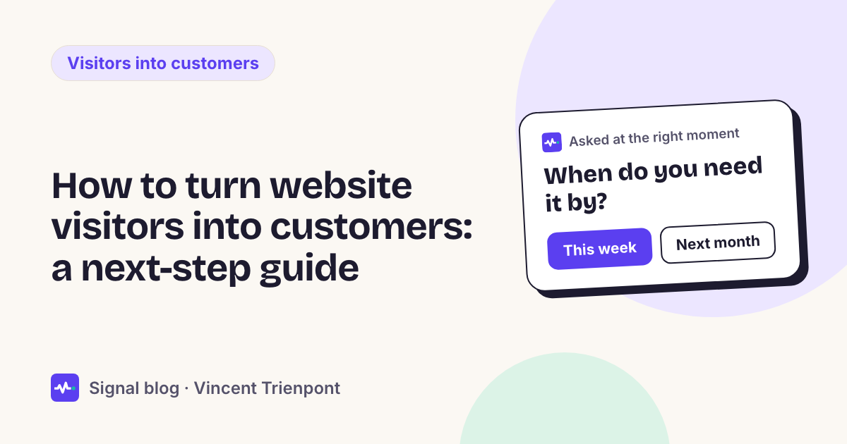
When the visit doesn't make the stage clear, ask. One short question with answers to tap, such as "How soon do you need this?" with "Today", "In the next few weeks" and "Just looking", sorts visitors into stages in one tap. The answer "Just looking" is as useful as the others: it tells you not to push. For how to write that question, see how to qualify leads with one question.
What should you offer at each stage?
Browsing: make it worth coming back
Leave browsers alone to read, and make sure what they read is good. If there's a next step at all, it's small and optional: a related article, a price guide, "email me when you publish the next one". Never a sales call.
Don't block them. Google's guidance on intrusive dialogs says not to cover the whole page, and to use banners that take up only a small fraction of the screen. For why a full-screen pop-up costs more than it brings, see popups vs one question.
Comparing: give them what they need to choose you
Comparers are building a shortlist, and they'll rank it before they talk to anyone. So the next step is information, not a meeting:
- Prices, or a price range, on the page. If a visitor has to ask what it costs, many won't.
- Proof that fits them: a case study for their kind of business, a before-and-after, reviews.
- What's included and what isn't, and how long it takes.
- An easy way back: a guide or a quote checklist by email, or a reminder ("Want us to email you when we have a slot in March?"). Ask for an email only, and only with their consent.
Ready to talk: make the quickest route obvious
A ready visitor wants to talk, so take the work out of it. Offer two or three routes side by side and let them pick: book a call, ask for a call back at a time that suits them, message on WhatsApp, or a short form. Keep the form to what you need for the first reply. Nielsen Norman Group's first rule for forms is to keep them short: cut any field you can work out yourself, ask later, or do without.
If you offer a booking link, think about who should take the call. A booking form can ask a question first and send people to the right person; see Calendly routing forms vs asking one question. If your visitors are in the EU, check where the booking tool stores their details: GDPR-friendly scheduling tools compares where the main ones host.
Then answer quickly. A ready visitor who hears nothing for two days has usually asked someone else by then.
Urgent: get out of the way
An urgent visitor doesn't want to read, book or fill in anything. Put your phone number and WhatsApp at the top of the page, especially on a phone, and make the number tap-to-call. If you can't always answer, offer a call back and say how quickly it'll come. For a trade business in more detail, see plumber website getting traffic but no calls.
Examples by type of business
The four stages are the same everywhere. What changes is what each next step looks like. These are starting points; use the steps your business actually offers.
| Business | Browsing | Comparing | Ready to talk | Urgent |
|---|---|---|---|---|
| Plumber or electrician | Tips and cost guides | Prices for common jobs, areas covered, reviews, a quote checklist | A call back at a time they pick, a quote form | Phone and WhatsApp at the top, a call back within the hour |
| Clinic or practice | Articles about treatments | Prices, what the first visit involves, the team | A booking link for new patients | Phone number, same-day appointments if you have them |
| Web or marketing agency | Blog posts, guides | Case studies by type of project, a price guide | A call with the right lead, booked online | Rarely urgent; a "we need help this week" call back if you take such work |
| Software company | Product pages, a tour | Plan comparison, customer stories, a trial | A demo with someone who knows their use | Support or login for existing customers |
| Online shop | Collections, gift ideas | Delivery, returns and sizes on the product page, a reminder of what they viewed | Help choosing, a quick answer in the chat | Delivery dates before a deadline, click and collect |
| Estate agent | Area guides, sold prices | New listings by email, valuation guide | Viewing requests, a valuation visit | A call back the same day for a viewing |
| Accountant or lawyer | Explainers on deadlines and rules | Fixed-price packages, what's included | A first consultation, booked online | A call back today for a deadline or a letter that can't wait |
For online shops the "ready" stage is the checkout itself, and most of what stops it is practical. In Baymard's survey, leaving aside the people who were just browsing, the most common reasons for abandoning a basket were extra costs that were too high (40%), delivery that was too slow (20%), and not trusting the site with card details (19%). For a shop that gets visits and no orders, start with why no one is buying from your Shopify store, and for helping shoppers pick, the one-question gift finder.
More by business type: agencies, trades, software, shops, clinics, estate agents and accountants and lawyers.
Five rules that hold for every next step
- One main step per stage, not one step for everyone. A page can show a booking link to the ready and a guide to the rest. It can't show eight buttons.
- Match the size of the step to the decision. "Request a proposal" asks a lot from someone who only wants to know if you're free next month.
- Answer the question that stops people, on the page. Price, area, availability, how long it takes. Every question they have to ask you is a reason to leave.
- Always leave a way out. "Just looking", "Not now", a close button that works. People who can say no come back; people who feel cornered don't.
- Be quick when someone does reach out. The best next step on the page is wasted if the reply comes three days later.
A worked example
This is an illustration, not a customer story. A five-person accounting firm gets about 1,200 visits a month and a few enquiries. Every page ends with the same "Contact us" and a form that asks for nine things.
The firm rebuilds its next steps around the four stages:
- Browsing: its articles on tax deadlines stay as they are, with a link to the services page at the end. No pop-up.
- Comparing: the services page gets fixed prices for its three packages, what each includes, and an offer to email a checklist of documents to prepare.
- Ready to talk: the form drops to three fields, with "Book a 20-minute call" and "Call me back" next to it.
- Urgent: a line at the top of the contact page: "Letter from the tax office? Call us today", with the phone number.
For returning visitors on the pricing page, the firm adds one question: "When do you need this done?"
- "This month": offer a call back today.
- "Before the next deadline": offer the checklist by email, and a reminder two weeks before the deadline.
- "Just comparing": show what's included in each package. No more questions.
Nothing about the firm's traffic changed. What changed is that each kind of visitor now has a step they're willing to take.
Where Signal fits
This playbook is what we built Signal to do on your site. A small script reads each visit: the pages read, in what order, for how long, where the visitor came from and whether they've been before. An AI model turns that into estimates you define, like "what are they looking for" and "how soon", each with a confidence. When an estimate is unsure and the answer would change what to offer, it asks one of your questions, with answers to tap, and it never asks the same thing twice.
Then it offers the next step you set: book a call, a call back, call now or WhatsApp for visitors who are ready; a guide by email or a short form for those who aren't yet; nothing for those who aren't interested. Your team gets an alert with the whole visit, and follow-up emails go out a few days later to people who agreed. You can run it in shadow mode first: it shows what it would have done on your real traffic, without visitors seeing anything. Signal never stores IP addresses. Plans start at €39 a month; see pricing.
When this playbook isn't enough
- The visitors are the wrong people. No next step turns a student researching boilers into a customer for a plumber. If most of your traffic will never buy from you, fix that first; website traffic but no leads shows how to check in 15 minutes.
- Your contact route is broken. Send yourself a test message from your phone before you change anything else.
- You have very little traffic. With a few visitors a week, ask your last ten customers what they nearly didn't do, and why. That tells you more than any analytics.
- You sell to large companies. The stages still apply, but the "ready to talk" step will be the first of several calls, with several people, whatever your website does.
Questions people ask
What's the quickest way to get more customers from my website? Check that a ready visitor can reach you in one tap from the pages they read most: a phone number, a call back or a booking link, not only a form at the bottom. Then add something for the people who are still comparing.
Should I put a pop-up on my site? Only a small one, and not the second someone lands. Google advises against dialogs that cover the page. A short question or offer in a corner, shown after someone has read a page or two, does the same job without blocking them. More in the website popup that qualifies leads.
How do I know which stage most of my visitors are in? Look at where they land and what they read. Mostly blog posts and short visits: browsing. Service and pricing pages, return visits: comparing. If you can't tell, ask one question with a "Just looking" answer, and count the answers for a month. For spotting the ready ones, see how to get hot leads from your website.